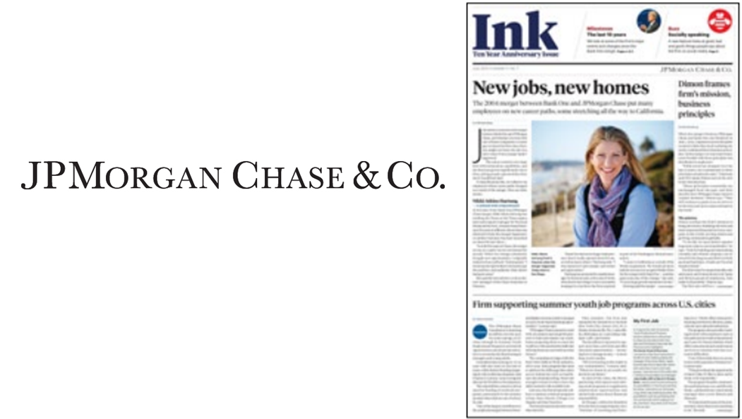
10th anniversary of merger leads to redesign of employee publication
Publication’s redesign focused on bridging the print and digital worlds.
You have to respect a managing editor of an internal publication who, after admiring the new design of a mainstream consumer publication, hires the designer behind that effort to redesign his own magazine.
That’s just what happened at JPMorgan Chase when Erik Battenberg, managing editor of Ink, liked what he saw in Bloomberg Businessweek’s redesign.
This was no simple task of mimicking a popular publication, though. The JPMorgan Chase team had more goals than just a new, cleaner look. Considerable time was spent on elements of design that many communicators gloss over, such as font selection, a consistent but bold use of color, and icons to represent recurring elements of the publication (such as a clock icon for the “15 minutes with …” executive Q&A column).
Rejecting the idea that financial institutions have to be stiff and formal, the team also introduced new features like a roundup of some of the “good, bad, and goofy things people say about JPMorgan Chase on social media.” Not surprisingly, the feature was a hit with employees.
The redesign has generated considerable buzz among employees, who have shared unsolicited praise with the communications group. We’re happy to honor JPMorgan Chase’s Ink with Ragan’s 2014 Employee Communications Award for Most Improved Print Design. Congratulations to Erik Battenberg and Cameron Martin for the outstanding new design.
View More Employee Communications Awards 2014 Winners.
Visit Ragan.com/Awards to learn more about awards opportunities.