The Scoop: How NASA embraced its kitschy, controversial ‘worm’ logo
Plus: Google’s top trends of the year and Russian propagandists use Cameo.

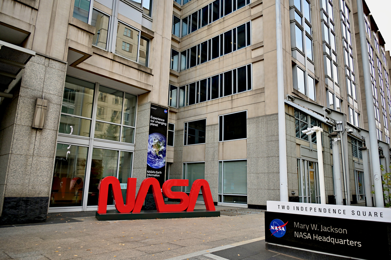
Quick, think of the NASA logo. What springs to mind?
It could be the sleek, Star Trek-esque globe, known internally as “the meatball.”
Or it could be this funky, thoroughly 1970s text treatment with bubbly orange letters. NASA calls that one “the worm.”
Used by NASA from the 1970s until 1992, the logo was deeply disliked by NASA insiders, who the New York Times said considered it “sterile and soulless.” But since 2015, there has been a populist revival of the worm logo – first on documents, then on T-shirts, eventually even pushing into space itself on the Space X Falcon 9.
Now the two logos are incorporated for different uses – the meatball far more commonly, but sometimes even alongside the beloved/hated worm.
As the New York Times wrote:
The meatball “feels like a government agency logo that has some weight,” (NASA Creative Director David Rager) said. “It lends a really nice authority, and it feels connected to the legacy.”
But the meatball is a complicated graphic with multiple colors, and not easily recognizable at a distance. “The worm is kind of the opposite of that,” Mr. Rager said. “So those two things kind of balance each other out.”
Why it matters:
Even if NASA insiders didn’t love the cartoony logo, there is undeniable benefits for its use. It speaks to a nostalgia for the NASA of many Americans’ youth and allows the space program to exist in a cooler, non-governmental way that calls to mind great sci-fi shows and the fun and adventure of space.
Combining it with the more official meatball is a positive middle ground that allows NASA to change its messaging depending on whether we’re talking a T-shirt or a rocket. It’s a smart bit of audience segmenting that plays on a fondness for the past without jettisoning its present.
Not every brand can support two logos, but for legacy brands that do have a history of iconic logos, it may be worth it to keep one around, even in “logo emeritus” status. Use it to communicate to different audiences and to celebrate your history even as you look to the future.
Editors Top Picks
- Google has released its top trends of 2023, giving a powerful, data-based peek into what the world is searching. Its lists are detailed and broken down by category and well-worth a peruse. Are there topics you can be newsjacking? Did your organization make the list, for better or for worse? This data is important in crafting content or social strategies – keep an eye on Google Trends data year round.
- Russian state propagandists used Cameo messages filmed by celebrities like Mike Tyson and Elijah Wood to create deceptively edited videos that made the stars appear to attack Ukrainian president Volodymyr Zelensky. The Cameo requests asked the stars to film videos asking “Vladimir” to get help for substance abuse disorder, CNN reported, and then edited the videos to make them appear to attack the Ukrainian president. The videos were circulated by state-affiliated accounts. It’s another example of just how insidious propaganda can be, drawing in unwitting celebrities who would have no way of knowing their words would be twisted. And this is without the use of AI at all – just clever editing.
- X owner Elon Musk has reinstated the account of conspiracy theorist peddler Alex Jones, the Washington Post reported. Musk decided based on an X poll to reinstate Jones, who has been banned on the platform since 2017 for pushing profoundly untrue lies about the Sandy Hook school shooting. “This will be bad for X financially, but principles matter more than money,” Musk posted. It certainly will be, giving skittish advertisers one more reason to avoid the platform and the inherent brand safety issues it seems bound and determined to keep raising. If Musk believes in these principles of platforming hateful speech, he might find himself on the platform alone.
Allison Carter is editor-in-chief of PR Daily. Follow her on Twitter or LinkedIn.


It is funny that you mention the NASA worm logo. Another similar logo created at roughly the same time was the Canadian National Railway “spaghetti” CN logo that now adorns all of the railways equipment. At the same time its rival Canadian Pacific was moving away from its classic Beaver logo to a multi-mark for all of its enterprises, the railway, hotels, ships and even aircraft. As the enterprises were spun off or disappeared CP has returned to its classic Beaver logo, jazzed up for the times. Since that time CN has stood by its spaghetti logo, while CP has gone legacy even in its new corporate identity as Canadian Pacific Kansas City.
What a cool story (and cool logo)!